this section includes installation, video, and collaborations
PeeKaBoo
Heidi Bergstrom and her daughter Haley Bergstrom-Borins present PeeKaBoo, a site specific, interactive installation that celebrates BEE CULTURE and history, and the HIVE of artists at Arc.Hive Gallery. PeeKaBoo consciously references and works in relation to the gallery’s own identity and play on the word ARCHIVE as Arc.Hive - whereby the gallery is the centre of the hive of studio artists. PeeKaBoo also seeks to decolonize bees by examining current practices in industrialized bee keeping, the imposition of colonial structures on bees and bee history, and restorying bee narratives.
The Gallery site Arc.Hive also references the notion of knowledge and a place of learning and knowing. PeeKaBoo simultaneously acknowledges and materializes the knowledge of and about both bees and artists.
The notion of Peek-a-boo is a first game played with infants where we cover our faces with our hands and open them to reveal our face with a grand expression and laughter saying Peek-a-Boo, I see you!! Or we might hide an object with our hands or material and then quickly reveal it. The game is intended to embody fun, curiosity, and joy. It teaches us from a young age that even though we may not see something, it is still there. It also helps with socialization, trust, and building pleasure in humour. PeeKaBoo therefore invites visitors to have fun, interact, and explore.
The notion of Peek-a-boo is a first game played with infants where we cover our faces with our hands and open them to reveal our face with a grand expression and laughter saying Peek-a-Boo, I see you!! Or we might hide an object with our hands or material and then quickly reveal it. The game is intended to embody fun, curiosity, and joy. It teaches us from a young age that even though we may not see something, it is still there. It also helps with socialization, trust, and building pleasure in humour. PeeKaBoo therefore invites visitors to have fun, interact, and explore.
As a site-specific work the artists will respond to the environment and facilitate inspiration and improvisation to occur in the moment. Activities and installation features include a 3d central, interactive bee cell with video projection, inside/outdoor window interaction, knowledge station of curated content, 2d related artworks in textiles and oil painting, book binding, and homemade bee products of soaps, honey, and keepsakes.
encrypted identities, decoded histories
I am thrilled that together with my daughter Adryan Bergstrom-Borins we will present "Encrypted Identities, Decoded Histories" a multimedia installation will be held at Xchanges Gallery and Studios in Victoria, BC from July 11-27, 2025.
I am very excited about this exhibition not only because it has been long in the making, but because I am for the first time, collaborating with my daughter Adryan. Together we are bringing together the story of our Icelandic and Metis heritage (no accent on the "e" is intentional), which for many in my family, has only been myth and legend. At the same time, we wrestle with aspects of our settler and Metis histories to unpack myths that are common in Canadian society and our own family and to recognize and
celebrate our ancestors.
celebrate our ancestors.
The work is one installation comprised of several parts, in a variety of media from textiles to traditional beading to video mapping, which were created in Iceland, Spain, Netherlands, and in Canada in Dinosaur Provincial Park (Alberta), Manitoba (Gimli), and British Columbia (Metchosin). The creation of this work has required extensive research both personal and academic, collaboration, experimentation, and learning. It has also required the support of many of you who have provided photographs, information, encouragement, and expertise in many areas.
We hope you can join us in person, but if you cannot we will be hosting an artist talk both online and in person on Sunday, July 20th at 2pm PDT via Google Meet. The talk will be recorded and published on my website and YouTube Channel. Please register to receive the link here: https://forms.gle/Y2P6mJNSaV7uSQWVA
phoenix
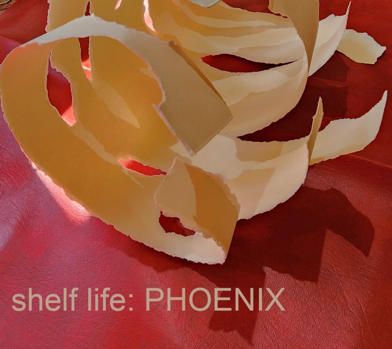
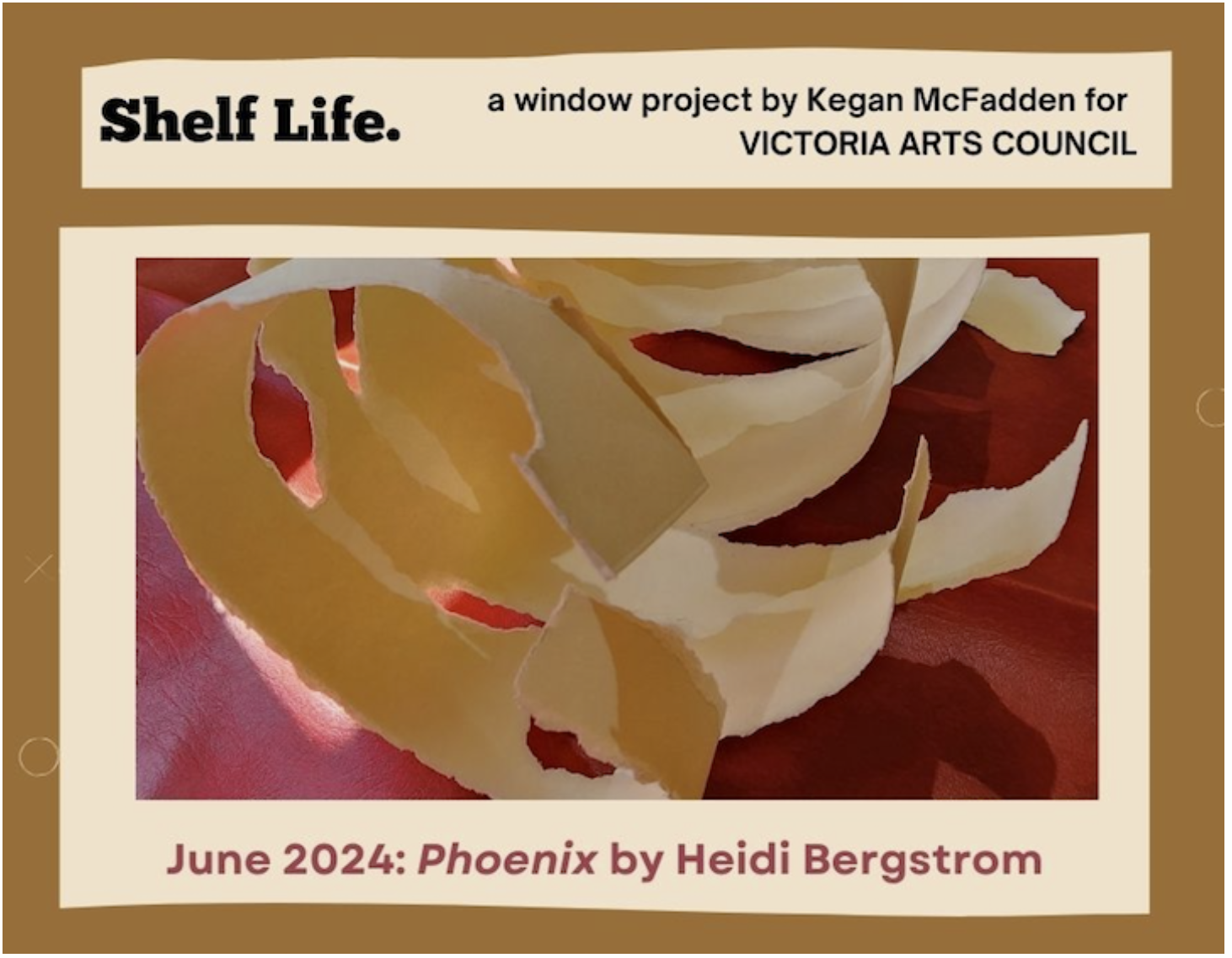
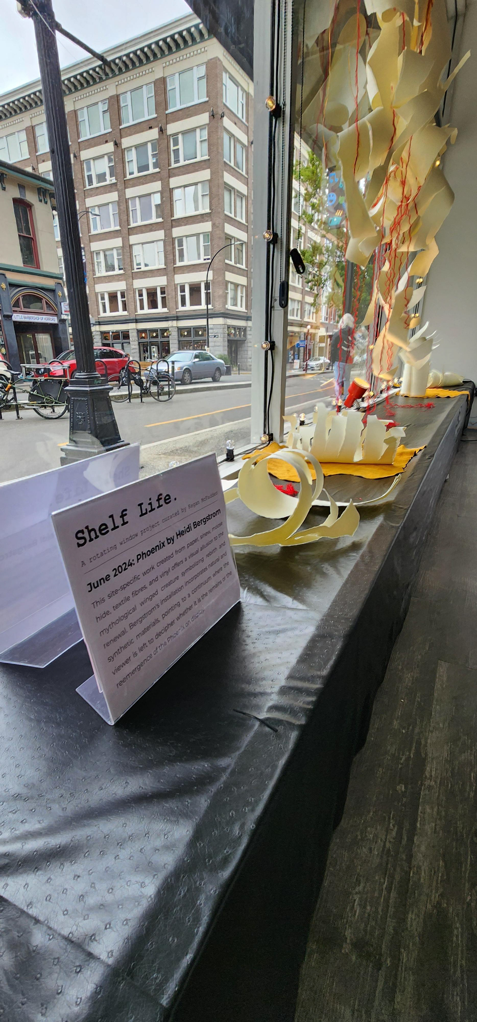
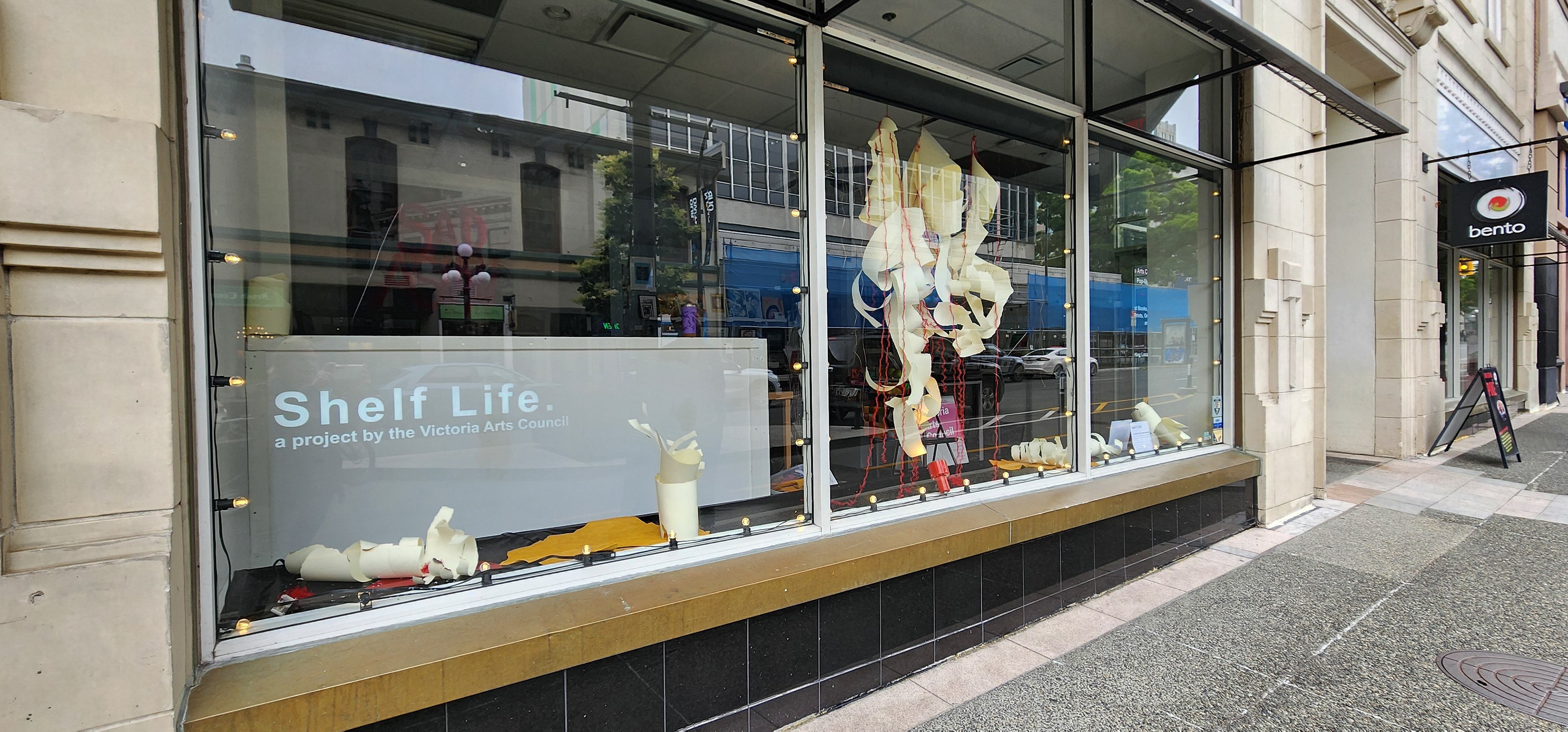
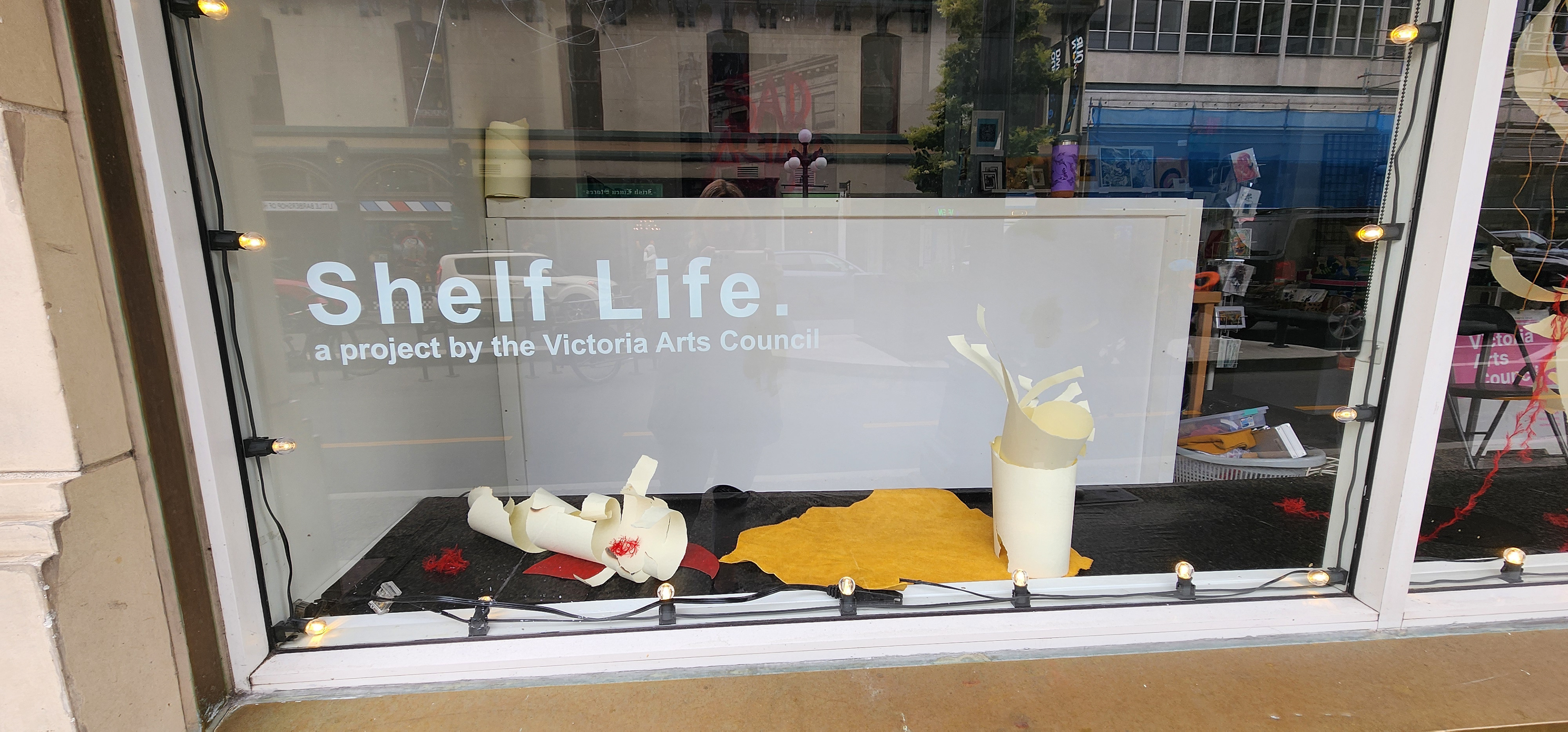
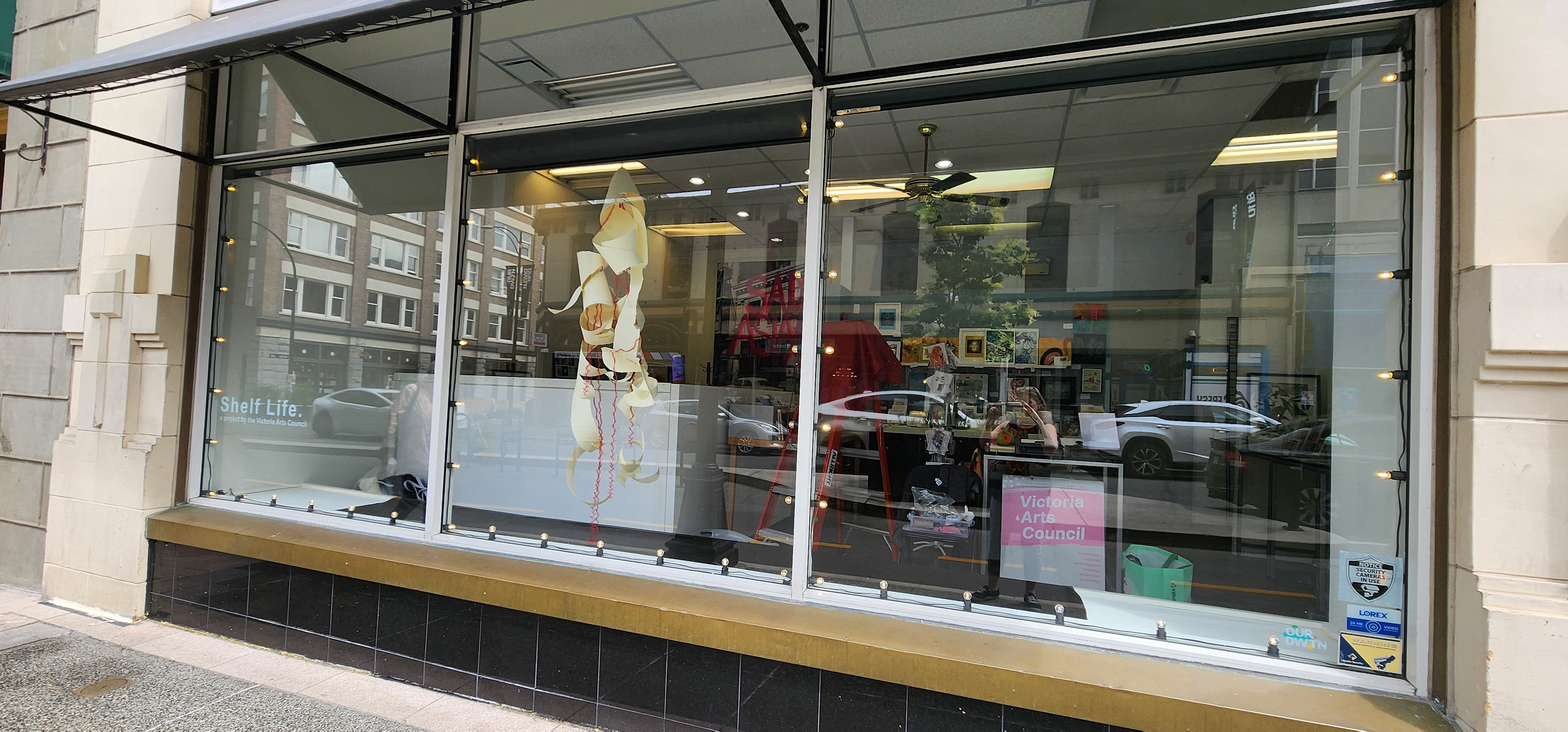
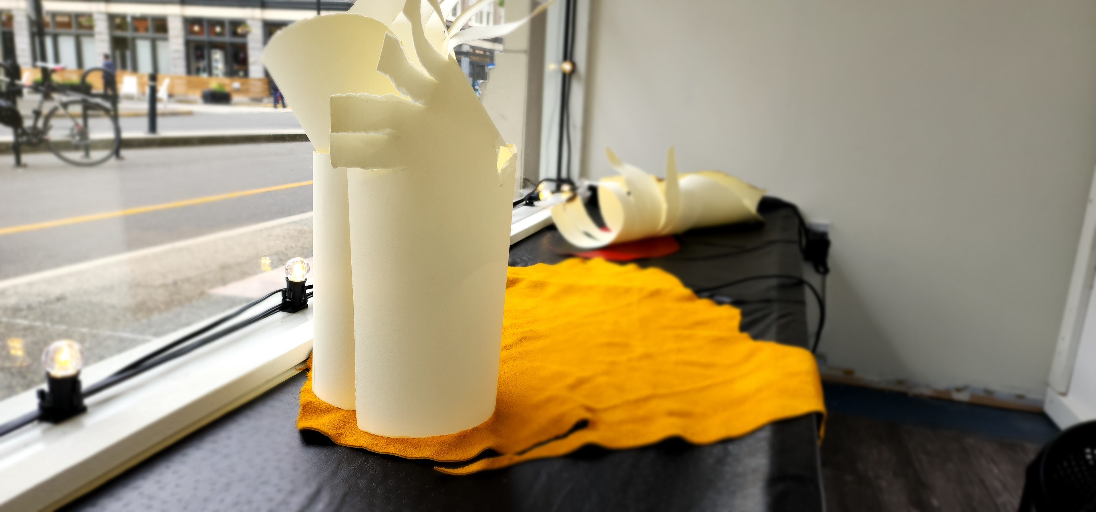
I was invited by curator Kegan McFadden of the Victoria Arts Council to create a site-specific installation for his one year project: Shelf Life. This bustling storefront window next to the Bay Centre downtown provided a great opportunity for me to incarnate an idea I had been working on for some time in the studio. The Stonehenge paper is one of my favourites as the large roll already has curled the paper. The surfaces of vinyl and moose hide, with sinew, threads, a bit of wind and light allowed me to play with the idea of the Phoenix from many angles.
littoral zones
I created this video collaboratively with two artists from the UK during a virtual residency.
Littoral Zones: the frontiers between is a collaborative video produced by aha! collective and filmed on their locations: Anna Goodchild: Paignton Harbour, South Devon, UK Heidi Bergstrom: Unceded Territories of the Sci'aNew First Nation Matheson Lake, Metchosin, BC Canada Ann Rapstoff: The River Thames, Little Wittenham, Oxfordshire, UK.
This project was initiated in Feb/March 2021 during a virtual residency at ‘ace Proyecto in Buenos Aires, Argentina where we met and began our collaboration - all done virtually.
Littoral Zones - SUMMARY DESCRIPTION
How can three artists living thousands of miles apart, with different artistic backgrounds and demographic differences collaborate to create a cohesive response to the idea of Frontier? The artists agreed to explore their major frontier - a common physical barrier, yet with many layers of meaning within the notion of Frontier - water. They recognize and attune to the definition of littoral as described by Bruce Barber (1998): Littoral describes the intermediate and shifting zone between the sea and the land and refers metaphorically to cultural projects that are undertaken predominantly outside the conventional contexts of the institutionalized artworld.
Through their process the artists synchronize and record their performative and exploratory actions in their water locales to examine, collect, return, and gather - all the while holding space for each other to bridge their separation and distance. The final work combines on-location footage, Google Earth satellite video traversing from the water locations in Canada to the UK and back, poetry, and sound and breath (voice). Video will be available in English and French (text only). Video Editing - Heidi Bergstrom For more information or to contact the artists see: annierapstoff.com studiohcanada.ca annagoodchild.wordpress.com copyright 2021 aha! Collective.
Presented at the Lucana Festival. We will also be hosting an artists talk on July 10th, 7pm GMT+1, and participating in a panel discussion on July 15th, 7pm GMT+1. Stay tuned for more posts on these and other events!
2 JULY-1 AUGUST 2021
2021 THEME:DISTANCE
The 2021 festivals have over 325 artists participating and they are representing 83 different countries.
https://www.lacunafestivals.com/2021-festivals.php
2 JULY-1 AUGUST 2021
2021 THEME:DISTANCE
The 2021 festivals have over 325 artists participating and they are representing 83 different countries.
https://www.lacunafestivals.com/2021-festivals.php
surveillance
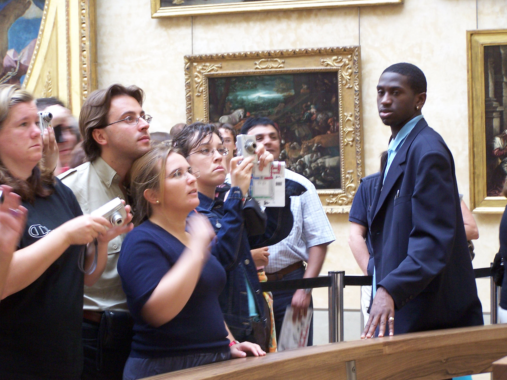
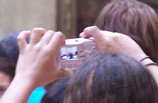
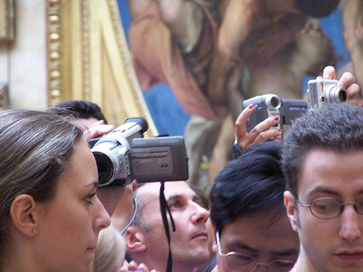
Surveillance - a video and photography installation, Paris, France 2005
Surveillance permeates our everyday life. From hidden cameras in retail surveillance to uncovering spousal deceit and international espionage. In this installation surveillance is viewed from 3 perspectives: as an activity by which we observe and participate in the exploitations of tourism particularly in art world consumption, personal explorations, and as storytelling. Unlike the more sinister applications of surveillance, this work offers at times dark, sometimes more humorous look at our behaviour and a reflection on cultural consumption.
This series of work is the result of spending 6 weeks in France in the summer of 2005.
Surveillance I, Motion graphics video; short story book “A day at the Pompidou” 6 min
Location: Centre Pompidou
This is the story of what can happen on any given day while sight seeing in Paris and taking in some of the most important galleries in the world. On this particular day we were visiting the Centre Pompidou, home to a vast collection of modern and contemporary art works but there were things going on outside the gallery that were also getting my attention….
The video is a motion graphics piece documenting the square outside the Pompidou centre during a whole day of visiting. The perspective starts from outside the gallery and entertainments that are taking place and moves to the inside the gallery looking out to the square as we traveled up the escalators to each level. My attention becomes focused on a man laying in the square. He has a wine bottle behind him and appears to be passed out. People and pigeons pass by seeming to not notice him at all. As I traverse each level of the gallery I see that the man has left, yet the bottle remains. Passers-by treat the bottle in a similarly unmindful manner. When the bottle disappears at the top floor, the artist finds herself in an unexplainable, irrational and absurd predicament. In an attempt to bring a different conclusion to the story the artist and friends re-stage the scene in the square and get some surprising results.
h3 realty: homeless homes for the homeless
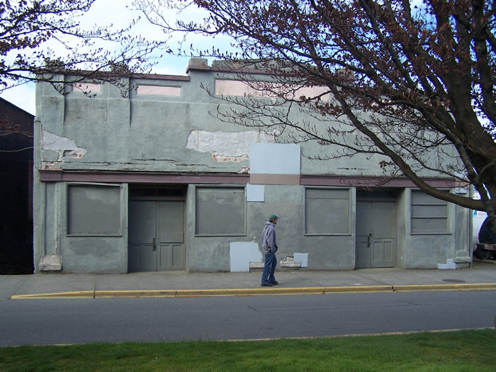


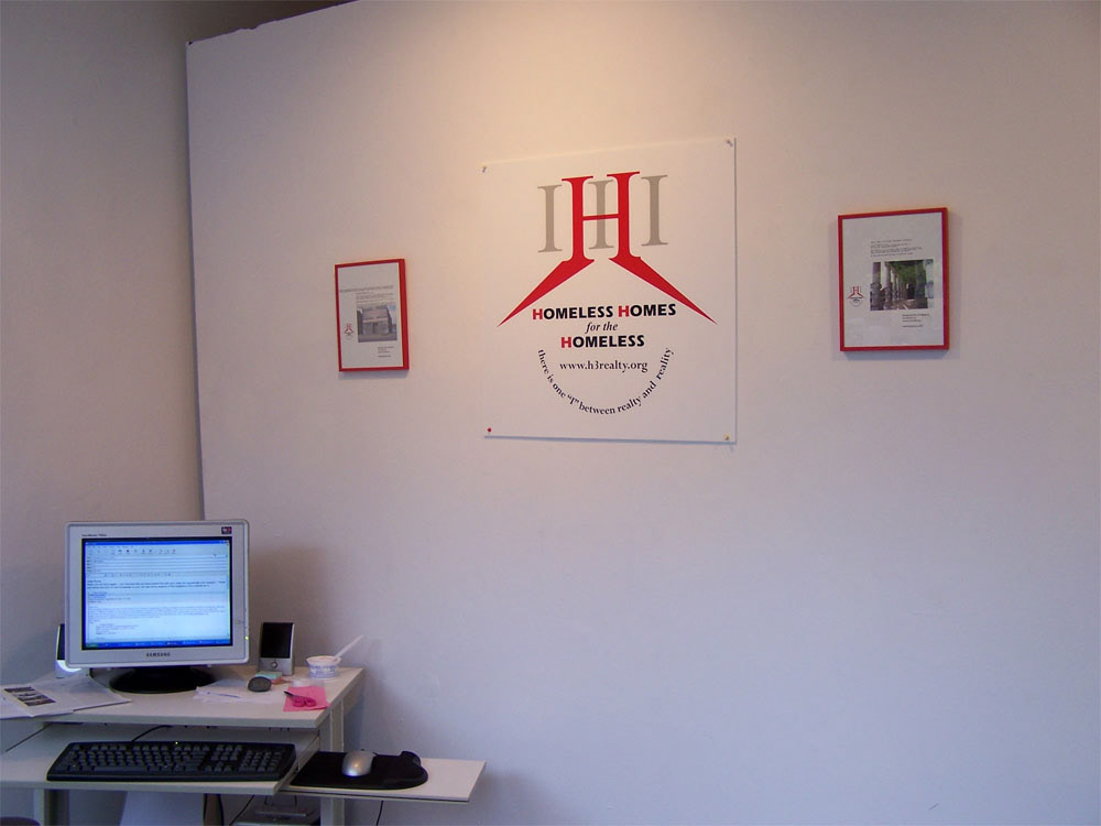
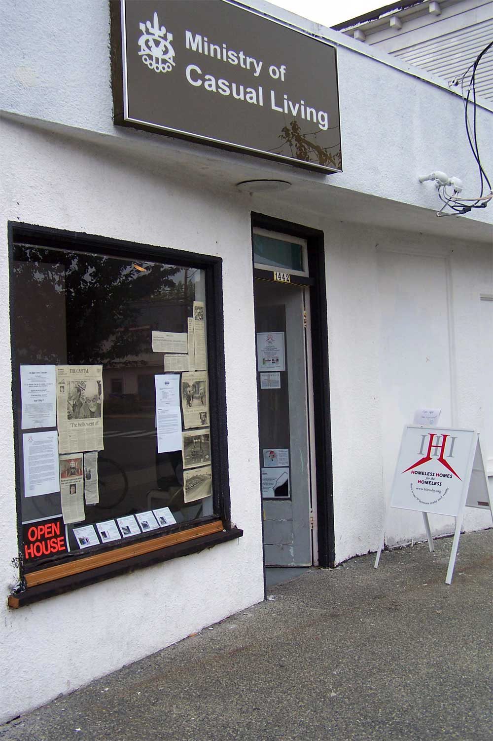
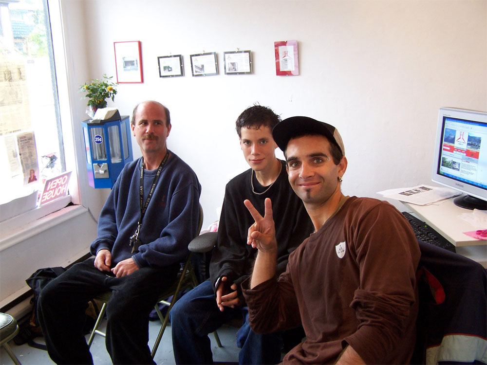
H3 Realty: Homeless Homes for the Homeless, Ministry of Casual Living 2005, Victoria, BC Canada
H3 Realty is an independent artist intervention, an invention, and an invitation. It seeks to explore and subvert the commercial-ness of home and homelessness. The impetus for this work came from several sources:
*Listening to a local CBC radio report on the inventory of 'homeless' in our fair city of Victoria, BC;
*Watching several back-to-back episodes of In Living Color, featuring Homey D Clown, The Home Boys Shopping Network and a unique homeless handyman improvement segment called "This old box" in particular.
*Hearing the song "Underwear Goes Inside the Pants" by Lazyboy repeatedly on 91.3 The Zone;
*Seeing a startling 'homeless' 'location' under a bridge in the Spadina Ravine in Toronto under one of the wealthiest neighborhoods in the city; and
*Working in commercial advertising for television (including the Real Estate Channels) and corporate marketing for 6 years and feeling that there had to be a way to subvert the conventions by adopting the conventions.
I decided to build an agency. What was needed was not a social service or government agency, but an agency known for success; an agency with a tenacious ability to create instant possibilities in dire circumstances ("Just a little TLC and YOU TOO can retire!" ;" A Real Fixer-Upper For a real Handy Man- LIKE YOU!")....an agency that uses language to transform the reality of what we see with our own eyes into an irresistible opportunity for creative living: The Real Estate Agency.
Thus, the simple yet inherently problematic for H3 Realty was born - the Agency's core marketing channel would be a web site highlighting central public properties as potential locations to fill one's real, imagined, or potential homelessness needs. Whenever possible the real-world office would emerge as an installation hosted by a gallery, thereby making the impossible possible, the virtual into reality.
These locations (both virtual offerings and real-world installations) are multi layered metaphors on public and corporate life and the associations of language i.e., the public purse, public opinion, public will and of course, public responsibility. These metaphors are reminders that 'homelessness' is not isolated to 'others less fortunate' and that we can choose to identify with this concept and potentially change it. In some ways, the backdoor service entrance to a public building like Government House is how H3 Realty helps us to visualize the reality for ourselves. After all, how often would one search real estate listings for others? if we did and the person was essentially homeless, what could we find for them?
The questions arose: is it possible to make a Real Estate Agency and transform it by transforming it's primary revenue functions into social benefits? Can such a thing exist in the real world without also being a non-profit charity? Is it possible to think of home/homelessness from a different perspective and what is our perspective anyway? Can art and web technology unite in this quest? How can we beat back this growing sense of frustration and helplessness?
Heidi Bergstrom, artist
H3 Realty - Homeless Homes for the Homeless, 2005
H3 Realty - Homeless Homes for the Homeless, 2005
The ReCreation Room, 2005, Xchanges Artists Gallery and Studios, Victoria, BC Canada
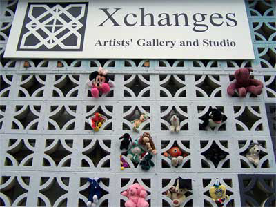
The ReCreation Room was a project initiated by Jessica Demers, Gallery Coordinator at Xchanges Gallery in Victoria, BC. In this project, artists freely exchanged or donated various cast-offs from their studios to be used in the creation of new works. I took the opportunity to bring in a bag of my children’s old stuffed toys and as fate would have it another artist, Victoria Edgar of Ground Zero Printmakers, was keen to work with me to do something with these gorgeous toys. We decided to insert the toys into the exterior concrete bricks of the building. I returned several times to add more toys and replace any that had been abducted or borrowed by the passing by public in the meantime.
For the opening I offered people the chance to get their portrait taken with their toy which I printed ion the spot using a Kodak EasyShare printer. In return the person would make a modest donation to the gallery if possible. Once again, I found reinforcement for working collaboratively with another artist and interacting with the public. In many ways the gifting of the toys worked on 3 levels: creating a spontaneous playful outdoor installation that any passerby could take a toy from if they needed or wanted one, providing a segue for audience participation and exchange with the gallery and an opportunity for collaboration between artists. The toys also created a startling contrast to the harsh exterior of Xchanges and the neighborhood in general. I had a strong sense of the vulnerability of these toys not only as the comforting playthings of children but as toys due to their materials.
the LabourArt Project
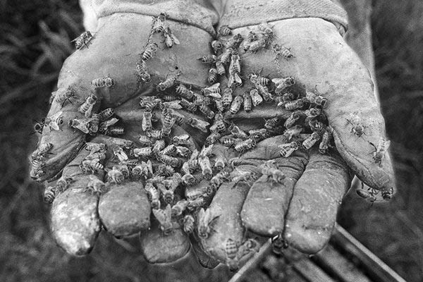
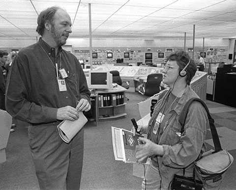
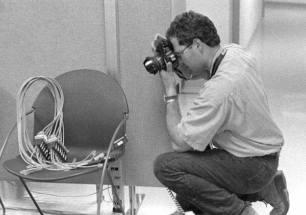
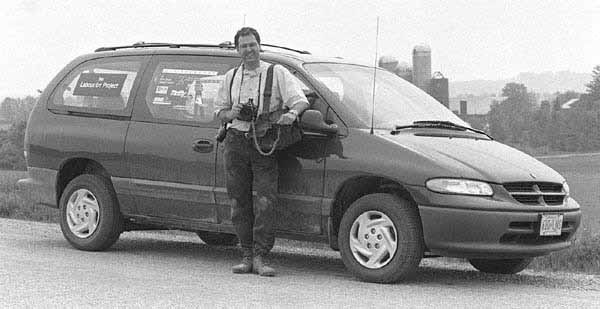
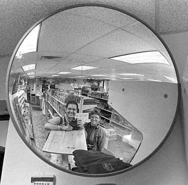
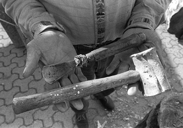

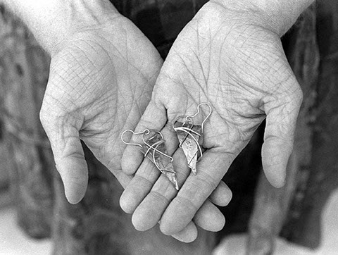
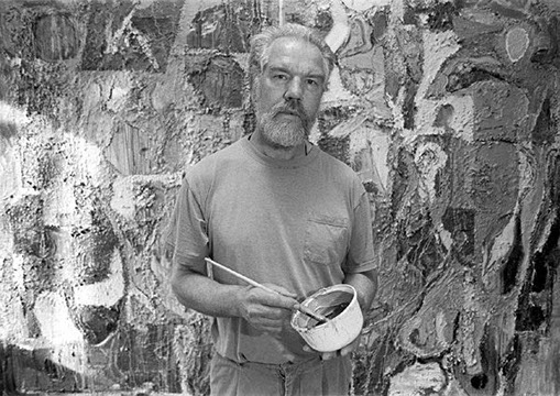
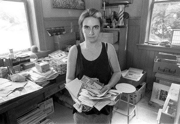
The LabourArt Project, Grey Bruce Counties, Ontario, Canada, 1998-2002
The LabourArt Project was a collaborative project I undertook with photographic artist James Masters from Owen Sound, Ontario. In this project we documented 24 hours in Grey and Bruce Counties through photography and audio soundscapes. The resulting work was mounted as a traveling exhibition to the Tom Thomson Gallery (Owen Sound), The Hamilton Workers Arts and Heritage Centre (Hamilton), the Canadian Auto Workers Education Centre (Port Elgin), and the Durham Art Gallery (Durham).
Each exhibit featured an interactive multimedia station where viewers could navigate the route via a Flash Map and listen to the audio soundscapes at the same time. A major curatorial objective of the LabourArt Project was to position artists together with other workers as part of the working community. In most cases this would be the first time these people would come into contact -through the gallery installation.
The exhibition toured to 3 galleries: Tom Thompson Memorial Gallery, Owen Sound; Hamilton Workers Arts and Heritage Centre, Hamilton, and Canadian Autoworkers Education Centre, where it was also used for the international summer social justice workshops.
The video and website won Best Interactive Video and New Media Project at the Sooke Film Festival in 2000.
site specific
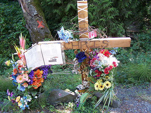
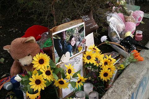
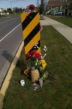
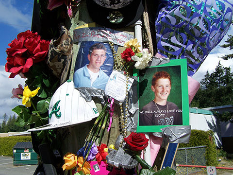
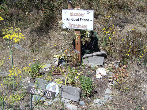

Site Specific, Vancouver Island, Manchester, UK, 2006- ongoing
Site Specific is a multimedia installation project that began as an exploration and documentation of road side memorials. I had observed many road side memorials in and around the environs of Victoria and while there was a set of easily identifiable traits to the memorials I was inexplicably afraid to approach them. There was something so tragic and public and personal about the memorials that forbid my approach – even though many of them are in readily public locations such as near bus stops where one has no choice but to be confronted by the memorial. Others were more difficult, even dangerous to approach such as on bridges or on busy highways. Later I even found some under bridges.
One day I came upon a news story from the US about an atheist group that was launching a legal suit against US Troopers who regularly post road side crucifixes to mark the passing of Troopers lost in the line of duty. The premise of the atheists (more or less) was that the crucifixes were religious in nature and therefore were offensive. The debate got me further interested into why people create these memorials and the function they play in society. Did it have something to do with the remoteness of the cemetery – literally and figuratively? The main thing seemed to be the location – the specific location of an event whether it was a car accident, possible abduction or even murder, location was the specific point of reference these memorials were making loud and clear.
The documentation of the sites over time took on new meaning and understanding. The questions arose as to what happens if a site is taken down as in the case of the mass memorial on Highway #1 and McKenzie in the summer of 2007, or the Gorge Road marker where Rena Verke was murdered? What are the implications and interpretations when memorials are violated or dismantled? Some memorials degrade over time but as they disappear a new set of artifacts are placed on the location. Who is taking care and watching?
While on a trip to Manchester, England in October 2006 I discussed the project with my brother and sister-in-law. As we roamed Manchester we began to document the memorials with the notion of comparing our findings to what I had discovered in Victoria. On the surface there were many similarities but we didn't have the chance yet to dig into the background of each memorial to really compare.
lucid waking
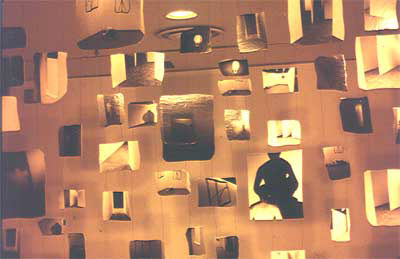
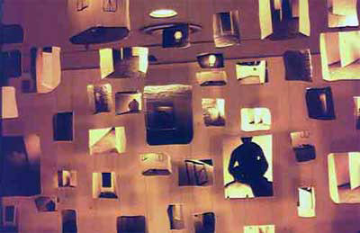
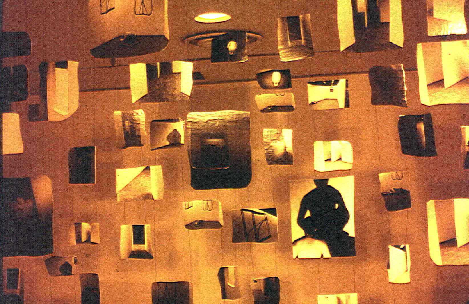
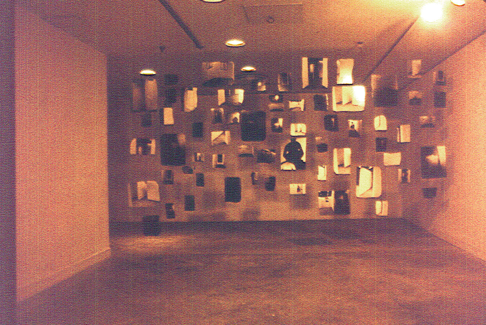
Lucid Waking" photography based installation, 1990
This work came out of the installation built at the Samuel Beckett Theatre (see background page on Coded Zones). While this show was installed I decided to place myself literally in this piece. I was greatly assisted by my long time friend and colleague Stephanie Moy-Shuster, a photographer and multi-talented artist.
The impetus to dry mount these photographs onto hand cut plywood came from the fact that I was already working with very loose, gestural forms. I wanted to try and bring that kind of unplanned gesture to photography. The plywood was cut free-form on the band saw, sanded and the edges painted. The photograph was then trimmed to the exact shape. In the gallery I wanted to create a wall of these images that were 'not a wall' but more of a scree. This led me to wiring each piece to the next in a sort of web. The cast shadows formed an integral part of the 'non-wall' effect. The IDA Gallery is shaped like a reversed L so I utilized the far opposite area to run a projector with detail images related to paintings in the same series that led to this work. This kind of referencing to previous work has continued for me throughout the years.
coded zones
paintings and installation
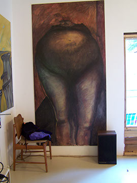
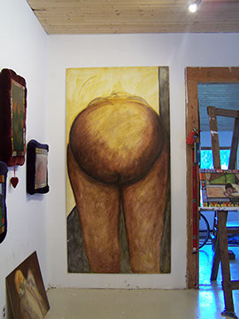
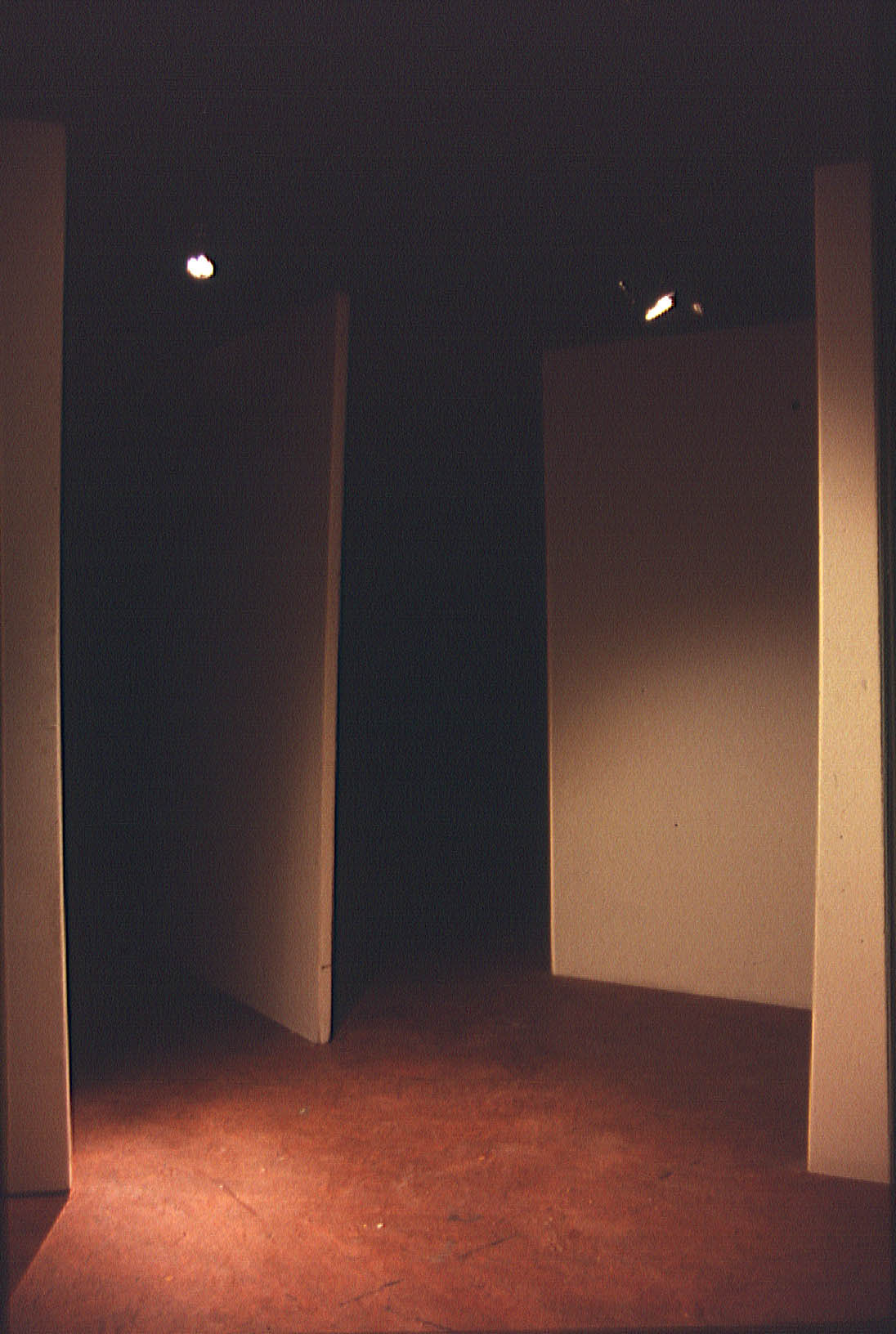
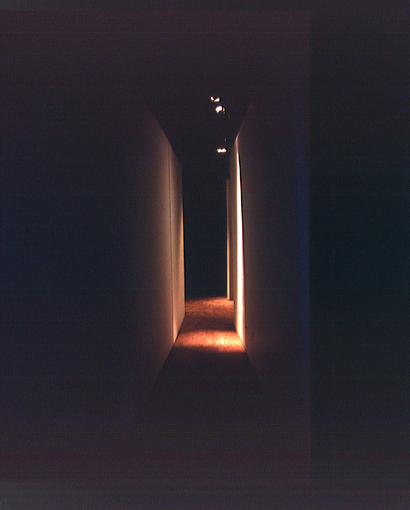
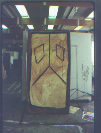
Coded Zones, paintings and installation, 1989
This work came out of a drawing class with Tim Whiten as well as my painting seminar with Eugene Telez while I was in my last year at York University. I had been working on a series of drawings and acrylic paintings that were really extreme abstractions of perspective in a room. The 'perspective' had to do with memory and how skewed things can get in one's mind. While looking at one of the paintings one day I stepped way back and suddenly saw this piece as a floor plan for an installation. At times I used to see this as a bizarre face akin to pumpkin carving. But, on this particular day I realized that the windows were like walls in a room from an aerial perspective - the 2 rooms being separated by one long wall. Claude Breeze entered the large women paintings for a Binney and Smith Painting award; I was one of two in Canada to win for these works.
I decided I needed to build this thing. I was fortunate enough to use the Samuel Beckett Theatre - which further afforded an opportunity to do some work with audio and atmospheric lighting. The paintings were hung next door at the Samuel J. Zacks Gallery.

